
+++Pious Honorius+++
+ Consilio et animi + By wisdom and courage +
The first time I saw my master, I was blinded. We had had the renegades cornered when the Warp bled on to Terra.
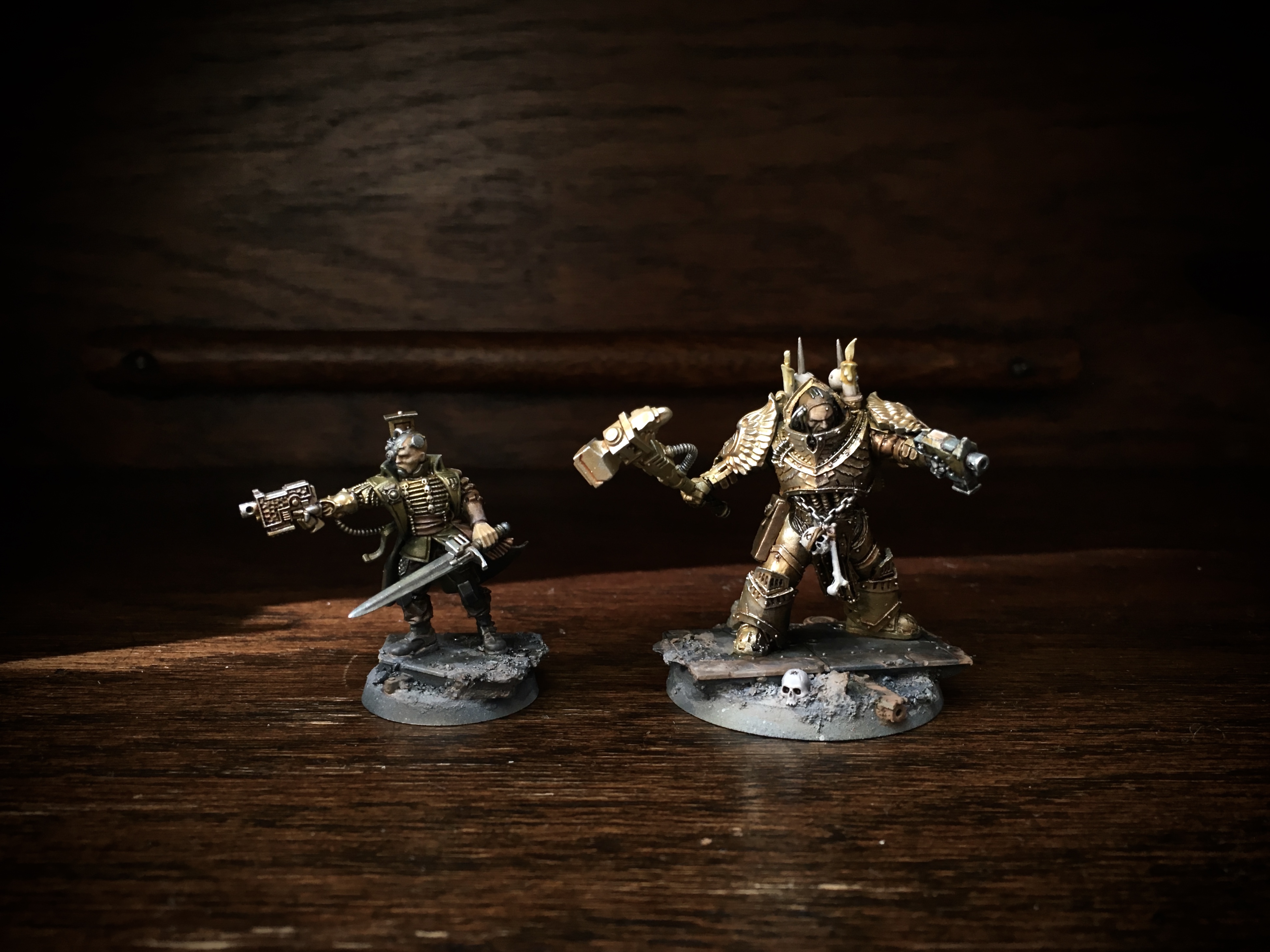
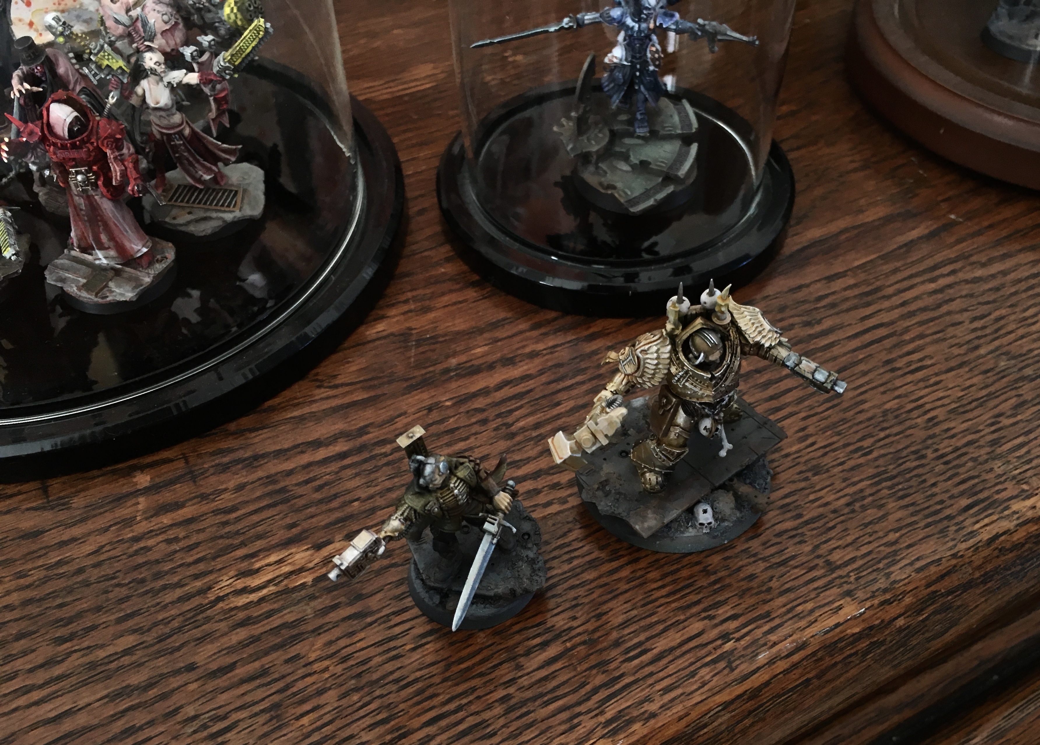
Here comes – The few first images of nearly finished members of the Illuminati Aquila, Lord Inquisitor Caius Celestine Pelagius. and Interrogator Oswald that will forever define what this project is all about. It’s an anxious moment, photographs will fully never convey the new found metallic radiance the miniatures possess. This has been perhaps the craziest new effect I have tried to achieve.
Drawing inspiration from Orthodox Catholic Icon art (where some of the richness in color comes from painting over gold) and the Cover of the collector edition 7th ed. rule book (which is the brainchild of a good friend, painstakingly executed for incredible sheen, matte yet reflective) I wanted to produce a group of miniatures that quite literally bring the Emperor’s light to the grim darkness of the far future, where there is only war. This is also the final installment of my Inquisitor Trilogy, my personal effort to celebrate and redefine the hobby and leave some kind of a mark. The first one “shaddes offe greye” had mixed grey into everything, and produced an Ugly, rag tag grim group of twists around the pariah Inquisitor Haag. A few years later, an adventure of gore and contrast for the Bad exploded around Inquisitor Alban Silas. Good was always going to be the hardest. It had to be the most sinister in its own way, and would need to compliment the blood and grey into a whole.
This would not have been possible with out an airbrush to get a super smooth and incredibly bright gold canvas to work from. So even the leather, or the clothes on the models, show some metal sheen trough. I then employed the incredible scale 75 metallic paints, windsor & newton inks and a bunch of my own mixes and the usual vallejo acrylics. Final oomph was achieved by Humbrol 11 metallics, a trick passed on from the Danish Grand masters a decade ago. The idea for the light in the group, is for everything to bleed out from Pelagius’ Hammer like it was burning with the golden soul of the Emperor. The Inquisitor’s left side is in shadow, face shaded to purple, the gold toned down a lot.
Without further ado, the art work that inspired and will provide the color palette (so expect muted oranges to follow to compliment the greens on Oswald) and the two heroes them selves, very very close to finished. I took these images in daylight after trying about everything. Have to say the iPhone 6s Camera is incredible and yet again performed better than more expensive and much bigger hardware that has now been permanently ignored for the bliss and speed of our iOS photo process.
The Emperor Protects!


The jump from grey weathered Vlka Fenryka to golden Illuminati is inredible!
Great to see how a single piece of artwork is used as a colour board for your palette. You did it with Vlka too. And with subtle variations carried it throughout the brotherhood.
It works wonders in these first two. Looking forward to see how it will be implemented in the Illuminati.
LikeLiked by 1 person
Thanks my brother! It was quite the trip to paint these. After Airbrushing I had these tacky Christmas decorations and no clue how things would end up. Bunch of stuff I tried on the way didn’t work at all. But equal parts courage and patience did see me through nicely. Now I am actually hungry and super inspired to paint more, the orange hues from the reference painting in particular.
LikeLike
Lovely looking minis, full of the grimdark essence of 40k that we’ve come to expect here. I love the tone you have achieved here and know from my own efforts how hard it can be to photograph metallic miniatures. Great work – I look forward to the full triptych.
LikeLiked by 1 person
Thank you. Have to say, before the evolution of the iPhone, not sure how I’d told this story. To have just incredible and affordable camera on me all all times has been great.
LikeLike
It feels poignantly ouroboric this project, Migs; not just because it sees the beginning of the end of a trilogy, but moreover due to the influence that Shades of Greyye had on me and the subsequent effect of the cover you mention above has had one you. It’s difficult for me to comment without having an emotional investment and an immediate emotional response and I can’t help but be both humbled and honored to have triggered a project like this.
The technique has worked extraordinarily well and I’m looking forward to seeing it carried over to a number of miniatures. I think this project would probably benefit from a larger surface to work on, too, something to act as a backdrop but also offer that sense of dizzying scale that you get in the Dainton painting; perhaps a vehicle or transport: a large boxy utilitarian vehicle rendered in gold is a very Imperial irony.
Anyway – a magnificent start. Really superb work. The Praetor was a great choice of starting miniature.
LikeLiked by 1 person
Thank you sir! Great minds think alike… 😉 I’ve been thinking a lot about building my own custom Space Cutter for these. With all the amazing plastic kits available I can totally see it working out, and the motivation for doing one you just listed out. It would be pretty insane.
Until then I have the nice little boxy sentinel to paint.
LikeLike
Astonishing, as always. A with your arlequin the muted palette feels incredibly close to the artwork and I feel a rush of inspiration to paint something in your same style right now!
You are really inspiring us all with your work, so keep on with it, it’s pure genius!
LikeLiked by 1 person
Thank you! The muted greens, reds and oranges should work really well here, as highlighted by the reference art work. The Harlequin palette was hardly muted though – purple, orange, blue ink straight from the pot 🙂
LikeLike
Beautiful and spellbinding… the effect you’ve achieved is incredible.
LikeLiked by 1 person
That gold is radiant. The relative lack of deep shading on the shoulder pads and hammer really brings a luminescence to the metallics. The comparative earthiness of the leather and bones on the Inquisitor is a nice touch. The coat on the companion is very nice as well.
LikeLiked by 1 person
Hats off to your newfound productive streak!
LikeLiked by 1 person
Mate, I’m always productive, just don’t get to direct it to miniatures as much as I’d like to 🙂 big difference to you artistic types who lose your muse :p
LikeLike
This comment might seem weird but bear with me 🙂
I’ve never really understood your take on the hobby. The artistic and eclectic approach didn’t make sense. Your talent however did, so I just accepted the other stuff as I enjoyed your work so much.
This last weekend however I finally think I can on a very basic level grasp your take. The reason wasn’t your work but my own Chapter 666 that garnered a massive amount of people ACTUALLY understanding what I tried to communicate just by looking at it. It might seem silly but I’m not like krautscientist nor the Weir brothers and their extremely detailed approach to blogging. I can’t write fluff for the life of me nor am I an artist like you sleeters or the profundis guys (these are just a few examples). The fact that people finally understood it was so rewarding for me and almost euphoric.
The point with all of this is that I now appreciate your work even more. The next stage for me is following up with paint and try to frame my miniatures with a mood. I’ll try at least 🙂
LikeLiked by 1 person
Excellent! Understanding isn’t necessary to enjoy something, but it does usually intensify the feeling 🙂 I’m following your adventure with keen interest.
LikeLiked by 1 person
Had a proper look finally so I can actually input a meaningful comment.. First of all, the golden armor and the Inquisitors Hammer is so hallmark 40k that undertaking it in miniature form is a grand challenge. And I’m so happy you’re pulling it off so well with some fresh techniques with proper historical gravitas!! The employment of religious techniques is just so spot on and fitting that I want to find something like it myself! So expect that..
But I am having to interpret images here and imagining how the effect will look in real life. I guess camera technology will have to still come a long way before us folks are happy.
Overall the interrogator works better atm, of which part is due to the henchman effect, but part is because he has more contrasting materials.
In the rulebook cover the vertical mid-section on both sides has this ominously coloured black smoke. I have a strong feeling that the addition of this colour somewhere, the tiniest drop of purple and blue, would serve to highlight the emperors light and make the models absolutely blast to life.
So looking forward to seeing them finished, and ultimately live at some point.. The subtlety of nuances we’re talking about here is just exhilarating 😄
LikeLike