I think it is time for a new Iron Sleet category, Musings. It’s a type of post central to this blog and our previous ones, where the author at times randomly dives deeper into thinking and doing processes behind the art. (You can Easily pull out category list by clicking the line icon in the top left corner and scrolling down. This way you can see all the Vlka Fenryka posts at once for example)
Something struck me when reading my fellow sleeteer Toni’s comment on the Illuminati Aquila post. The four of us chat a lot behind the scenes and it really helps all of us grow as hobbyists, but also the creative professionals we are for a living.
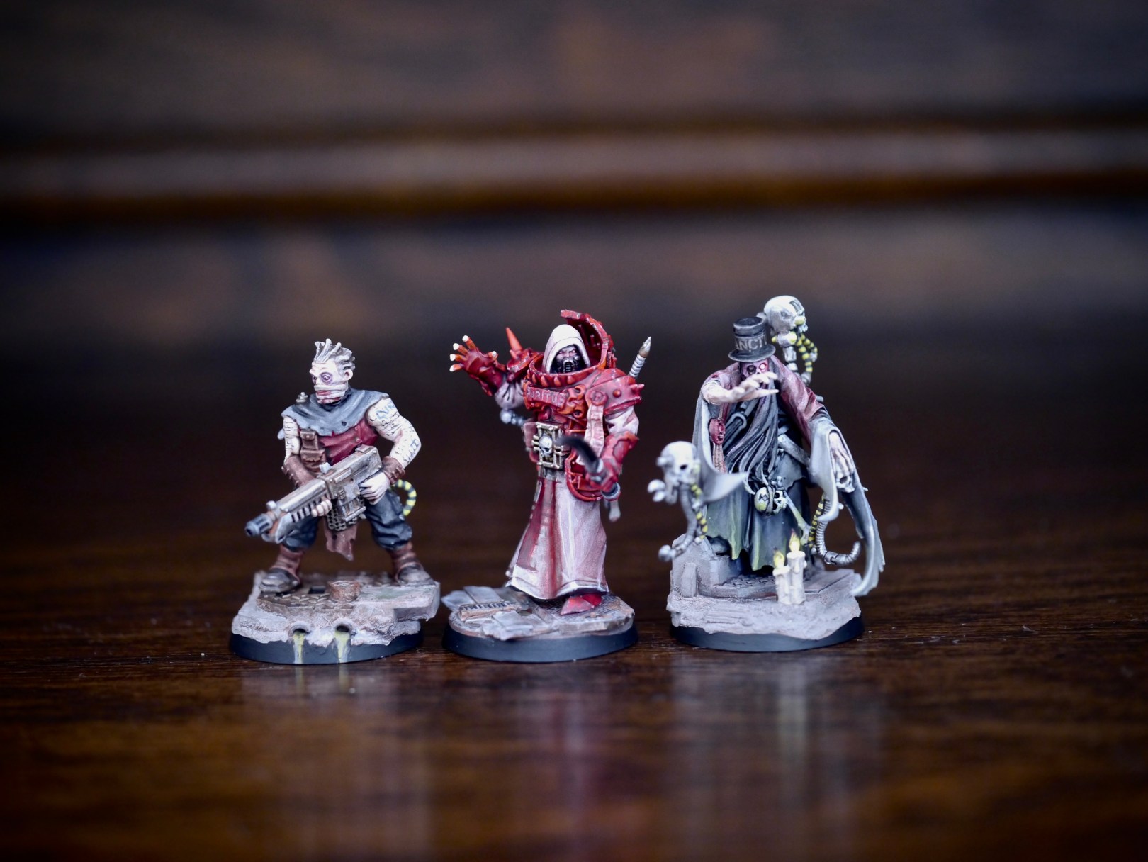
“Overall the interrogator works better atm, of which part is due to the henchman effect, but part is because he has more contrasting materials.”
I wanted to discuss both how wrong Toni is in saying one model works better than the other when it’s a group and also the henchmen effect he refers to.
Hierarchy, contrast and not all men were created equal
Contrast as a noun can be defined as “the state of being strikingly different from something else, typically something in juxtaposition or close association.” For building a group of individuals, contrast is the primary narrative and visual tool to create impact. The inquisitor is all golden, singular, iconic, for the very reason to make the interrogator (and all the rest of the upcoming motley crew) look more normal, darker, and henchmaney.
The Henchman doesn’t “work better”, they are doing a different job. Imagine the inquisitor having been painted with the exact same level and distribution of contrasting materials. Then neither would work. Building these retinues is about building a hierarchy and contrast from something normal, something human, something fragile, something we can possibly physically associate with, or even pity all the way to something superhuman, something powerful, something we can aspire to or imagine. Now imagine if I said the Inquisitor works better because he is more powerful. How interesting would a group of equally and similarly powerful individuals be?
The Humble Human Henchman (or HHH)
Something I recently coined to describe what has been a critical ingredient in not only each of the retinues I have built, but also the Vlka Fenryka army project! HHH is a character to set that human baseline. An anchor from which the horrors, god warriors, psykers and masters of arcane lore spring to their glory or infamy.
Shades offe Greye, it was the ultimate, tortured human, Devlan Munt who was the first HHH. (apologies for the grainy image, it’s been years from his birth)
“As the day before, and those before it, a deep, mustard hued mist hung around the endless rusty hacks of the east end. A huge bulky twist galloped towards the epicenter of this excuse of a Hive Sector. After him came two others, inhumanely thin, twisted even for twists sort of twists. And a Twist with a long pointy hat and no left arm. Then a group of four, or rather three carrying something that looked like a fourth.
Fething feth – where are they all going? He knew of course, but why? Gevlan cursed his deformed back that ached after the long stalk, and then slipped into the night, moving with stealth and swiftness totally unexpected of his appearance.” (Full story)

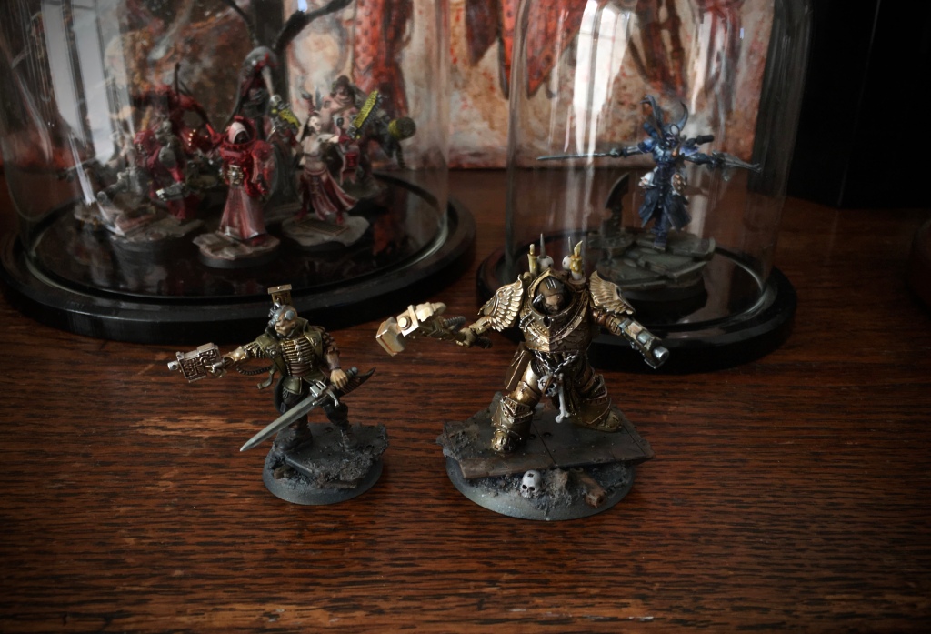
For Red Storme riseth, the devil speaking caretaker Tobias wore the Mantle of the HHH. Pictured here on the left alongside the rogue Inquisitor Silas.This retinue had three HHHs, surrounded by the freaks. (Red Storme Riseth full gallery)

And not surprisingly, the the HHH is the most important model to design for the final installment of the trilogy.
It’s not about basing, it’s about living in the grim darkness of the far future
Toni makes a great observation in his comment too, referring to the art work that inspired my retinue in the making.
In the rulebook cover the vertical mid-section on both sides has this ominously coloured black smoke. I have a strong feeling that the addition of this colour somewhere, the tiniest drop of purple and blue, would serve to highlight the emperors light and make the models absolutely blast to life.

Take a closer look at the basing of the Illuminati Aquila retinue. I would say my execution is completely identical to what Toni said, even if it was so obvious it was hiding in plain sight. Black base, storm grey smoke airbrushed in, and yes, plenty of blue washes in there! And obviously not an accident.
Musings part 1
Hopefully this has been insightful. We are really curious to get your feedback if this sort of article is of value to you and we should do more.

Nice article. I pretty much agree on all points here, but a couple of points may deserve more discussion.
First, I’m not really sure what “works better” really means in the context of Toni’s statement. Is it a more effective paint job? Modelling? Visual impact?
As you point out, each figure does it’s own job as part of the cohesive whole, so is the interrogator supposed to be better delivering the intent of the group in Toni’s eyes, and not adding complementary to the Inquisitor? Considering that each is an individual part of the greater sum, in this context the “better” statement doesn’t make sense.
On the other hand, perhaps within the dynamic of the retinue, the leaders who are supposed to be what all others aspire to as icons, are too far above the rest so as to be alien to the common dregs of the rest of the group. If the henchmen are there for us to find sympathy in, perhaps by elevating the leaders to such mythical and otherworldly heights, they no longer resonate with the viewer as being a part of the cohesive whole, and in this case between the choice of these two models, the more relatable piece of the interrogator is seen by Toni as the one that is actually of a higher quality because it’s the one that speaks to his nature as a “common” human.
As in Art, I don’t know if there really is a definitive answer when taste, perception, and interpretation are involved.
Interesting discussion.
LikeLiked by 1 person
Yes, now it’s definitely worth thinking about what “better” might be… 😀
But in this case I was referring to the fact that the interrogator holds the interest of my eye for a longer period. Since the inquisitor is all golden, as said, singular, the smaller guy by possession of other materials has a little bit darker shadows and brighter highlights. The interrogator’s own in-built material contrasts are stronger and more abundant.
Now the contrasts between different characters of a retinue is another thing, and this is also a big reason why building warbands is so superbly rewarding. I fully expect the Inquisitor’s comprehensive goldenness to become a focal point (esp. his hammer) for the group. Notably it’s not a group yet, which is why I used the abbreviation for ‘at the moment’ in the quoted comment. As henchmen are added to surround him, it would actually be quite exhilarating if each of them could hold the viewer’s attention for a substantial time, while the first obvious point of focus would be the big golden man.
And what comes to the hues on the ground, happy to hear that even the execution is identical. I just can’t wait the world to bleed a bit on to the characters themselves..!
There is some great play to be had on whether the Inquisitor is a flawed man who surrounds himself with talent, or a “perfect embodiment of the emperors light” (apostrophised because no-one is) who surrounds himself with wretched individuals, or any of the other permutations of this group balance dynamic.
This ought to become a good discussion..
LikeLiked by 1 person
Good points.
I think one of the most interesting things to me about this discussion is that I actually had the opposite reaction than yours to the two figures.
I found the Inquisitor much more interesting (both visually, and conceptually) than the interrogator. The contrast between the brilliance of the gold on the armor, and the earthiness of the tones on the face and cap speaks volumes about the nature of the Inquisitor himself.
There were many times in reading these comments and looking at the original post that I had to remind myself that he was not supposed to represent an Astartes. The armor itself is so representational of the superhuman, and the gold coloring so representational of the power of the Emperor, that the effect is supposed to lend that air of godly authority to the Inquisitor. However, contrasting this with his bare head brings the character back down to earth, showing that it’s really just a man (albeit, a powerful one) playing at being a god.
The trophy bones slung around his waist further emphasize this, dually, by showing his reliance on the hubris of fetishist intimidation (showing off the spoils of past kills), and by reminding the viewer of the persistent threat of death to ordinary men, of which he is one – you could argue points of iconography on this point, but by and large, I perceive true gods to be above this.
I certainly like the interrogator, and as you say, he has more points of visual contrast and interest, but I find those points not quite as interesting as the dichotomy that the Inquisitor represents.
LikeLiked by 2 people
This is an excellent start to what should prove to be an exciting feature for Iron Sleet! It really got me to thinking, so much that I wrote my own post about it on Between the Bolter and Me, examining some of the ideas presented here. Briefly, I admit that creating a dramatic contrast between an Inquisitor and their henchmen can be a very effective way to creating a retinue, but I feel the opposite provides a very interesting angle to explore, as well. I think Dan Abnett championed this concept in the Eisenhorn novels, by creating a character who is relatable and not particularly superhuman. He is just a flawed man, who surrounds himself with equally talented and interesting individuals.
LikeLiked by 1 person
I read your article which was excellently put, and a great counterpart to this one.
http://betweenthebolterandme.blogspot.co.uk/2015/11/musings-what-makes-inquisitor.html
It’s really enjoyable to see your Invitational stuff also in new light, just as Migs unearthed the Greye and the Red. Looking forward to seeing the retinue grow!
Your article serves to remind that we’ve been thinking about these things for a while now, although not necessarily putting them to words. Dan Abnett is a good reference also in how some of the Horus Heresy groups are constructed. Even though god-like beings wage eternal war, there’s always the human thrown in the mix, to anchor into ‘reality’.
*excuse me for replying here, the blogger platform proved too cumbersome today..
LikeLiked by 1 person
I am glad you enjoyed the article! After reading the one here on Iron Sleet, I just could not stop thinking about it, and knew I needed to get some of the thoughts down.
The release of Inquisitor was a revelation for me with the hobby, because it made the universe into a more nuanced, interesting place, apart from the billboard heroes (Space Marines), and the evil-for-the-sake-of-evil Chaos Space Marines. Finally we got to see the setting through the eyes of real people. And after this, I was never quite as interested when GW released a new Inquisitor that was simply an archetype of a character, with unmodified astartes power armor and a oversized plasma pistol. It just seemed lazy and a step back from the world they introduced with the Inquisitor role-playing setting. This is why I was so excited to discover some like-minded individuals on blogs from around the world, like Iron Sleet, that was exploring these more interesting aspects of 40k.
LikeLike
Brilliant discussion guys!
Apologies for the slight provocation to get the topic going, but I think it worked and “better” without explanation is not a very useful comment when discussion miniatures (or any art)
All my superhumans are grey, multifaceted, “Eisenhorns”. Who was definitely also superhuman – as in possessing abilities and talents far superior to a human being. Off to read Eric’s post now.
LikeLike
Brilliant article Eric!
LikeLike
I sure hope the next part covers NLBGC (nurgle lord big guy conversion) because that’s my favorite! Bah, not as snazzy as Triple H there 😉
I really like this discussion on a more serious note because we’re now into what strikes a chord with us and hence why this little slice of 40k appeals to us. My Invitational entry my inq ended up as the hhh as his henchmen where all very exotic. My second gang with a magos was the opposite but I did have a better mix of types in that gang. All of this happened quite subconsciously tbh. Now with Chapter 666 I’ll explore things even further. Or at least try 🙂 Though what has entranced me the most is my heavyweight henchmen. I’m talking big guys xxxxl. Most likely they’ll be background and part of my terrain in-game but I still find them to be the most satisfying builds. I haven’t built my last Wrecks type of model yet!
I look forward on seeing the next installment. Seeing the process in written form is actually very fun so kudos to you en Eric for taking the time 🙂
LikeLike
The big guy henchmen are awsome indeed. But mostly so if you bring a mere standard human to insure that the big guy ha a regular dude to stand out from. I enjoy the discussion and especially the references to Abnett using regular human characters through which to see the grandour of the Space marines for instance. In writing Abnett really nails the concept, but taking it to miniatures we need to scavenge the ranges, convert and build to create the contrasts and differences that really makes both the mere henchman as well as the massive muscle-machine shine. And they shine best as a group.
Miklu: Great addition to the topic types here at the ironsleet. “Musing”… Might pick that one up myself.
LikeLiked by 2 people
Absolutely. It’s the contrast they bring into the group that makes the whole better. Though I must say that the nurgle lord must be one of the most iconic base figures in INQ28.
LikeLiked by 1 person
Jakob, please do pick it up!
LikeLiked by 1 person
I certainly agree that the current range of Space Marines, while good models, simply do not do justice to mythical warrior-god status that they are too a normal human. Instead, they are the size of guardsmen and have an average statline upon which everything is based. The contrast between a true-scale Space Marine and a human is an exciting dichotomy to explore, particularly considering that even though an inquisitor might be tiny in comparison to an Astarte, they may be equally powerful, just in a different way!
LikeLiked by 2 people
Eric – that is my Vlka Fenryka in a nutshell, with the ferocity of Fenrys and it’s wolves thrown in. Nothing nails the imagery of these games quite like a Marine conversion from a FW Primarch next to a Fantasy Battle (RIP!) model converted for the grim darkness of far future.
LikeLiked by 1 person
Good points Jakob. Contrast is one of the key factor when it comes to creating tension. To make things interesting, there needs to be tension. Things are lame and safe without tension.
P.S. The day GW starts producing art-scale/true-scale Astartes I’ll be demented 😉 When it comes to taking Abnett’s and the concept it is based on in to miniatures, there’s something magical in the process of crafting your own real Astartes. To me it was one of the purest hobby moments when I finished my first Astartes conversion.
LikeLiked by 1 person
Fabulous discussion. I’m a massive fan of the ordinary guy in the 40k universe. Without frail and all too mortal humans, the setting becomes far too overblown. Space marines are cool, but what’s much more cool and interesting is mere mortals’ reactions to meeting one.
So my own humble efforts in miniature have started to focus much more on the average soldier. Rather than the common man being there to make the Astartes look even more impressive, I see the Astartes as serving to make the human look all the more frail and small.
LikeLiked by 2 people
Hi MonkeyBallistic, we are massive fans of your blog! Wish you (and so many others) would jump over to wordpress age for ease of commenting and better quality user interface. My HHH for Illuminati Aquila is very similar in style to some of your recent models. Albeit more humble 😉
LikeLike
Thank you, that’s very kind of you, although I’ve not been very productive recently.
I have to confess to knowing virtually nothing about blogs and websites and all that new fangled stuff. They didn’t have computers when I was at school 😉 I may look into WordPress though if for no other reason than the blogs I see on WordPress just look a lot prettier than blogger.
LikeLiked by 1 person
Hello,
Very interesting discussion! I really like the ‘think twice’ attitude going on here. Especially when this leads to those kind of models which have that certain aura of authenticity, which is always storytelling to me.
One aspect that I think hasn’t been mentshioned yet, is the body language of figures.
The inquisitor from the Illuminati Aquila retinue, for example, has the quite same pose as his henchman. But while he is yelling, his henchman has a much cooler look on his face. That gives him (the Henchman) a, well… maybe more faithful expression. For me, he could also be higher in grade, concerning his body language.
But when I see an inquisitor wearing a golden armour, I think of a man who must be hunting beings that obviously don’t care if you are visible, like camouflaged, or not. Not in the mortal way:) I mean he’s that kind of inquisitor who’s behind the big fish! An elder maybe.
So if he had a pose more dignified, maybe just walking tall, while his guardsmen around him are doing their job, cleaning the area and stuff, it would create a whole different and additional kind of contrast. Most notably in a bigger group. Making him stand out significantly.
But they’re both great! I have a truescale space marine project going on myself, and I think I will also use the preator model as an inquisitor one day. A really great idea!
Regards!
LikeLike
Thank you sir! There are so many different ideas and dynamics to study. Within the trilogy, I decided all there Inquisitors would be armored, active and aggressive in the beginning. These shared elements highlight the differences in their approach and outlook better than more obviously making them different in my mind. Having said that, I have contemplated creating second versions of them at times… In more clandestine setting. Stripped out of their armor. Maybe even revealing Silas’ face.
LikeLike
Oh cool! That would definetly be an interesting project. It’s a pitty that GW never did that really in 40k. Like with Gandalf, or Valten. I hope they will keep the actual version of Archaon additionally to the upcoming Beast-riding one.
For that project I mentioned, I thought about posing from the beginning on. And I decided to make all minis as if they are in the same moment and same situation affecting them all (what? ah, no. More special than just total war). Like you’d make a diorama: In my imagination, they’re all stepping through some big (big!) door in an old citywall, overseeing a wide open landscape in front of their eyes. No enemy to be seen, but they know its the place of their upcoming adventure, and only a few will return. And now, how would they behave? A gunman would propably hold his gun ready to fire. While specialists have nothing to do yet. A sergeant gives orders to someone, Heavy weapons are transportet instead of fireing, snipers climb to some higher spot, use binoculars and so on.
I hope with this method, that small army will look more like in a picture. If you know what I mean. I hope not a boring one:) We will see. Musings! I like it.
LikeLike