


Don’t really know what to say at this point..
This has been one of my biggest learning experiences in painting for the past year. I decided early on to really abandon my usual manners and try a really rich textured, even quite messy, style. The process was both rewarding and challenging. I didn’t really have a plan, more like a list of ideas. An uphill battle if there ever was one.
The main learning points; reduce, reduce, reduce, and try things out on the palette before applying paint on the mini!
There’s a smooth silver lining though.. In the aftermath of this crazy expedition I’ve mapped a gameplan for painting the Exanimus warband. This experiment served as a stepping stone towards a new direction. Something more coherent and decisive.

Beautifull and Imposing …
LikeLiked by 1 person
Whatever you’re doing, it’s looking good!
LikeLike
Glad to hear!
LikeLiked by 1 person
This is very nice. I love the grounded, muted-earth tones of the palette – it allows for a depth of richness to the paint to set the model in a proper atmosphere rather than it just having a good paintjob. The paint establishes both character and setting. Looking forward to seeing the rest.
LikeLike
It’s actually true that both caharcter and setting are strong in this case. Having a good paintjob might be a sidequest overall 🙂 or something that is nice to have, but not essential.
LikeLike
Fantastic work on the painting! Your experimental efforts look to have payed off! I love the drab and dusty tones you have achieved, the red color in particular is wonderful. The white detailing one his robes look really nice too and add a great deal to the character.
Keep up the great work!
LikeLiked by 1 person
I actually really really love it. This is really painting a model. The adventure and intent shows. In everything. One of my all time favorite models Toni!
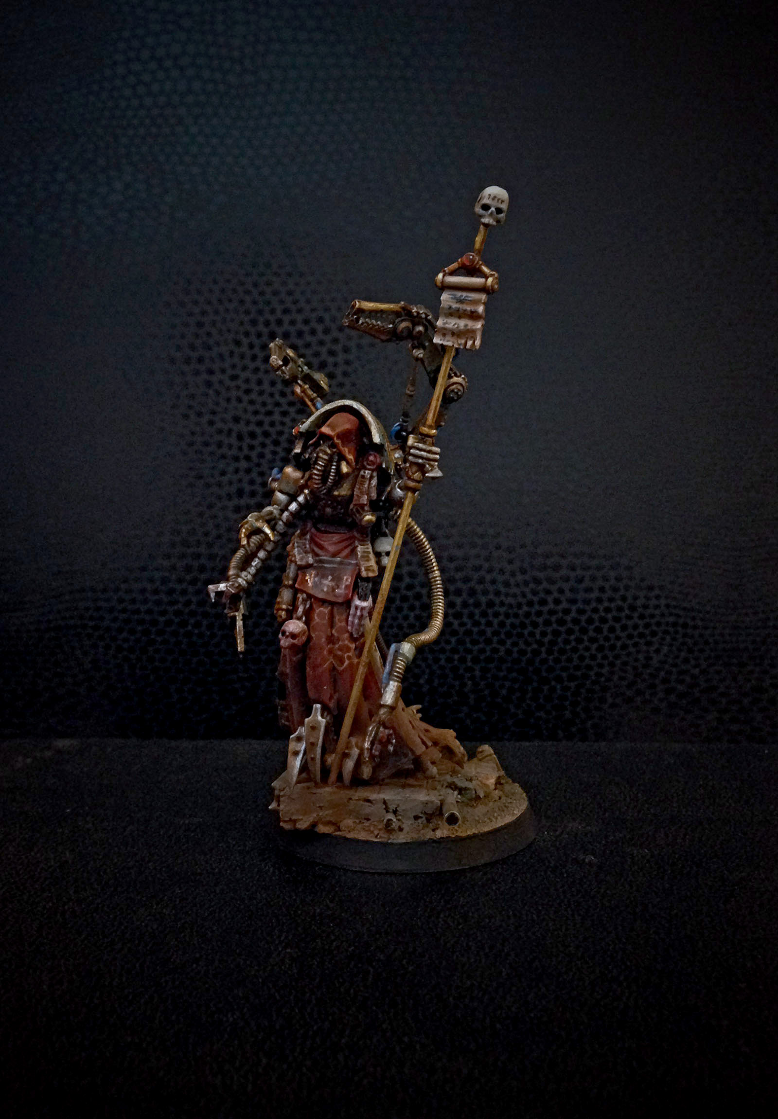
There is one caveat. I don’t get the blue cables at all. Feels like you’ve chosen to draw the eye to the least important part of the model and the blue clashes with all of the rest of the palette. I don’t know if you would consider reprinting them with very dark green or Browns but I still decided to mention this because the bright blue really seems out of place.
LikeLiked by 1 person
Looking awesome. Lots of feel!
LikeLiked by 1 person
That’s a thing of beauty and totally chimes with how I think the Mechanicum should look.
The painting is wonderful and I love how much texture you’ve managed to get in there. I do however have to agree with Migs about the blue cables. Over all though a stunning model.
LikeLike
If going over the cables is a decent fix, it’s one I’m happy to make! I have a theory that some models you learn from, and others you simply use to solidify what’s already been learned. Maybe the first ones are somehow more valuable, although they don’t give that same gratification. And possibly they are also more interesting.
LikeLike
Toni he is huge! Stunning miniature that gives me all the right feelings. While the colours on the robes are great I think my favourite bit is the little banner he carries, totally at odds with the rest of his mass, and a great colour. I have no problem with the blue cables. its not like he would care what colour they are. But as Migs and Monkey have said they do draw the eye away from the rest of him.
LikeLike
That’s what I figured, he wouldn’t care.. But we do 🙂
LikeLike
Absolutely marvelous model, Toni. It´s got so much presence (a very disturbing and sinister presence at that).
The pics are a little dark though – I´d love to see more of him/it, being such a nice mini and whatnot..
LikeLike
I lit them up a bit on photoshop. They did seem a bit too dark now that it’s day again..
LikeLike
Well your experimentation paid off! It’s always a bit nerve-wracking to push oneself out of the comfort zone but when it works out the reward is so much better.
Not sure if I agree on the subject of the blue cables (there’s always one who ruins a good consensus isn’t there?) On the one hand I agree that they stand out too much and draw attention which isn’t really warranted but on the other hand he needs a colour that isn’t red/brown to pull him together and stop him looking too muddy. Think Migs’ suggestion of dark green might do the business though.
Love the patterns on the tabard by the way. Am I right in thinking they’re chemical structures – in which case, what of?
LikeLike
Chemical structures and traditional kimonos were an inspiration. Nothing precise there, just looking for a feeling..
LikeLiked by 1 person
Beautiful
LikeLiked by 1 person
Purge the bloo – and I o not mynd muddy at all …
LikeLiked by 1 person
Toni, that is bloody brilliant mate – and so deceptive as well! The proportions are so good that I had no idea of the scale until the pic with the regular sized dude… fantastic job! I’d agree that the blue is probably not the best choice for the cabling (green, or yellow/black striped perhaps? ), but that is a minor thing really… the robes are lovely, the detail is fascinating, the composition is spot on, and the characterisation is sublime. Bravo!
LikeLike
Thank you! Yellow/black would’ve been too obvious I felt, and since this was all about exploring new frontiers I went with a rather risky approach
LikeLike
Toni, the photos are really small. Even when I click them. Any chance for an edit so we can fully appreciate your work? 🙂
LikeLike
WordPress apparently did not want to show them full size when the “tiled mosaic” view mode was selected..
They are now individual images
LikeLiked by 1 person
Much better! Thanks!
LikeLike
Love it! Pass me the green stuff, I need to get busy!!
Keep up the good work guys. 🙂
LikeLiked by 1 person
Fantastic! I love the creepy, tall stature of the figure – the companion figure serves by way of contrast (BTW, he’s also excellent, love that grey skin tone). I love the grimy base too. Migs is right about the cables though. Keep pushing your technique!
Regarding pic size, why not just crop in, then we get to see more of the miniature for the same image size – there’s quite a lot of dead space around it.
LikeLike
Oh what I’ve missed whilst I was away! A very interesting character. Love the feel of the paint job, like he’s coming up from the depths as you described in your first post about this character.
Have to agree about the cables, made me realise I’d done something similar recently that needs a re-paint.
LikeLike
Very beautiful! Lots of wonderful details on the robes.
I have to agree on the blue cables. I don;t think you even need to repaint them completely if you don’t want; I bet a few passes of an amber, orange, or rust colored ink/glaze would blend them in to the warmer color scheme.
LikeLike
Absolutely gorgeous! This is seriously one of my favourite models of all time.
Any tips on how you did the robes?
LikeLike
Magnificent. I do agree about changing the blue but in every other thing eminently worthy of the high praise from the Master Illuminator, Mr Laurence.
You’ve avoided the Mechanicvs altogether…excellent. The whitish gown suggests a twisted chirurgeon… I don’t think he’s wearing a tabard (shudder)…. to my mind the splattered crimson on the front (see the second picture) is not dye but rather blood… I strongly imagine him coming across some interesting hydrocarbon meriting future research and simply daubing the pattern in the biochemists convention into the blood soaking his robes so we see the white underneath lest he forget it…
I looked at the picture again and see what you mean by the tabard held on by the two purity seals… red or daubed patterns in blood? I think I distinguish the letter J with two dots, a cross and a p with a crossbar (a cursory search of the special characters section on Microsoft Word failed to reveal it as a foreign character… has it a meaning?) The ‘wavy’ line around his hood reminds me of the DNA helix…
The eyes are dead black, glassy, objective, remorseless…
He is filthy, blood-spattered and begrimed but as in Thistle’s paintings he has those glimmers of golde, the glorie of the temple-world. The gold of the augmetics reminds me of a fine victorian microscope… I imagine the wealthe of the exanimus has equipped him verie well… while the golden staff and charter are visibly a signe of prestige, a link to the goldene temples and basilicae, a sign of office.
His sinister attendant (a house dessicum trooper?) is a fascinating blanchean mix of the middle ages and the modern, his heavy cuirass, filthy and grimy, has the knightly look I remarked on for Ulbus — it is extremely well made, but decayed over millennia, some relic that House Dessicum either inherited or can afford… his mask by contrast is a crude horror of rubber tubing… the white pattern reminds me faintly of the crowne of thorns – can you explain?
LikeLike
Though bases are only backdrops I thought I should add you all catch the squalor, dust and filth of terra just as I imagine it…
LikeLike
Pleasure to have the work so thoroughly inspected mr. Gray!
You touched on some aspectsbon the model I wish would get noticed. The base is actually a very important part especially for this project. We’re all eagerly awaiting to see what Migs comes up with regarding the table.
The lettering I referenced from the excellent Emperor’s Will book, which I kept open during the painting process. Another tome of inspiration was the Alexander McQueen book produced for the Victoria and Albert musem exhibition last year. Best exhibition I’ve ever attended.
The armoured human sized figure is actually a part of the Blind Faith project, and unrelated to Pilgrym. I shall expand on their storyline shortly..
Man this really feels like a beginning of a really cool expedition to the lower manufactorums and halls of Terra!
LikeLike