
Hello,
The inter webs just ate a lengthy musing on what this project has become to mean to me – probably for the better. I had tried to describe the entire Epicness that Pilgrym has grown to be and detail how much I’ve loved working on the ghost legion.
There is a style developing here. Years in the wilderness spent experimenting are coming together in my favorite subject matter. I think the work is both cinematic Warhammer 40000, yet uniquely mine. Some people will love it, some won’t get it all. Most will think it would benefit from this or that change. But most importantly, I am finally truly happy about the journey and results.
When Iron Sleet was born, there was an agreement and an aspiration to push Warhammer 4000 imagery in to new depths, with collective work that would share some strong values (and surprising shared taste) but be deeply individual. We wanted to inspire each other and all the readers. And I think Pilgrym is becoming a testament to that.
So today I have three new Ghosts to share and a few pictures that talk to some of the tools and trials I’ve done this time.
The Ghost of The Green Room (Story and WIP)
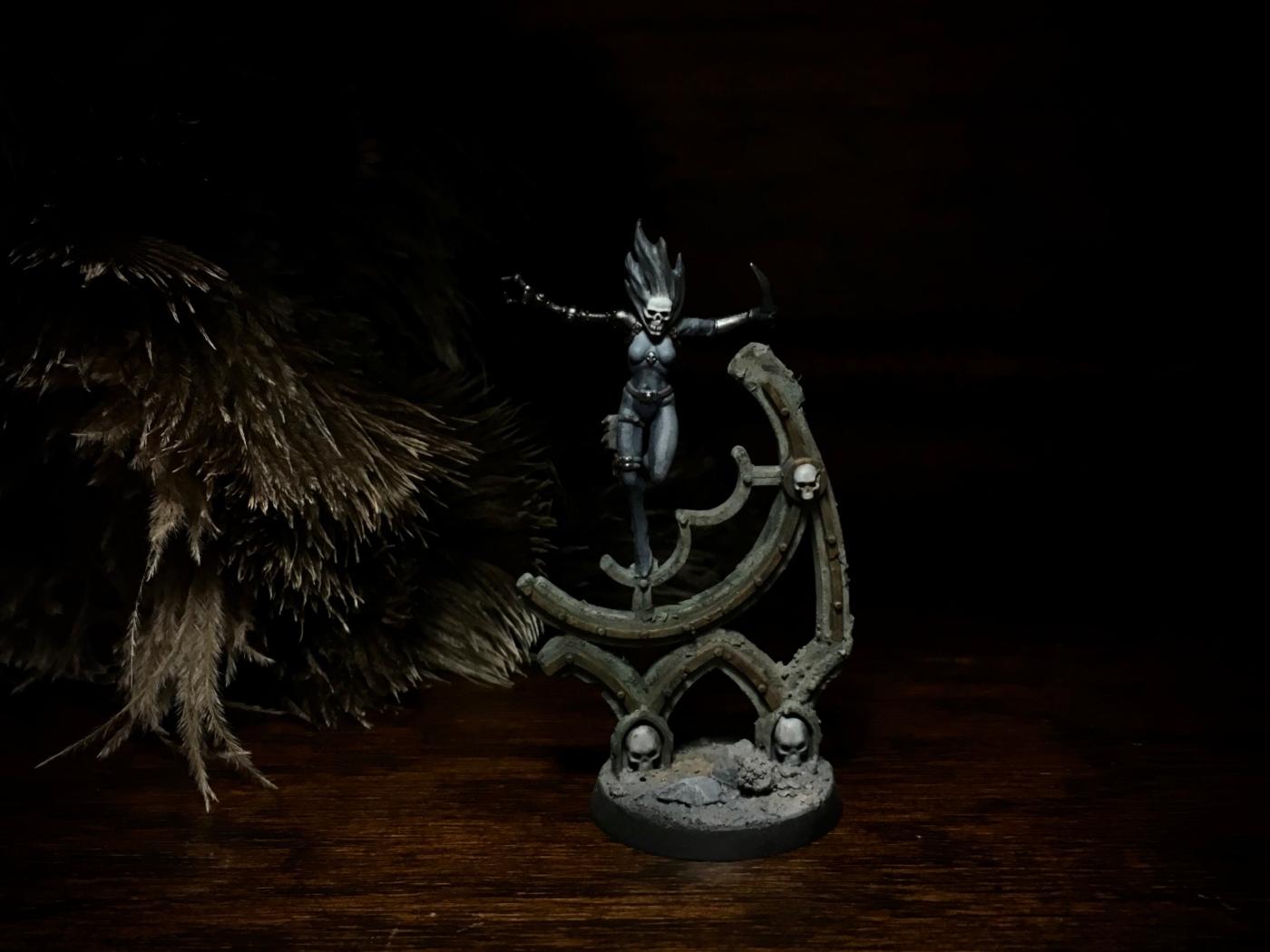
The Twist
(Mutants are being recruited to rule the underside of the Temple for the Ghost Legion)

And a humble new XX operator on the left.
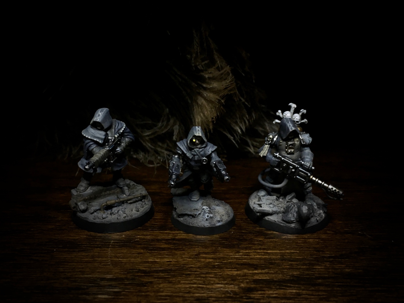
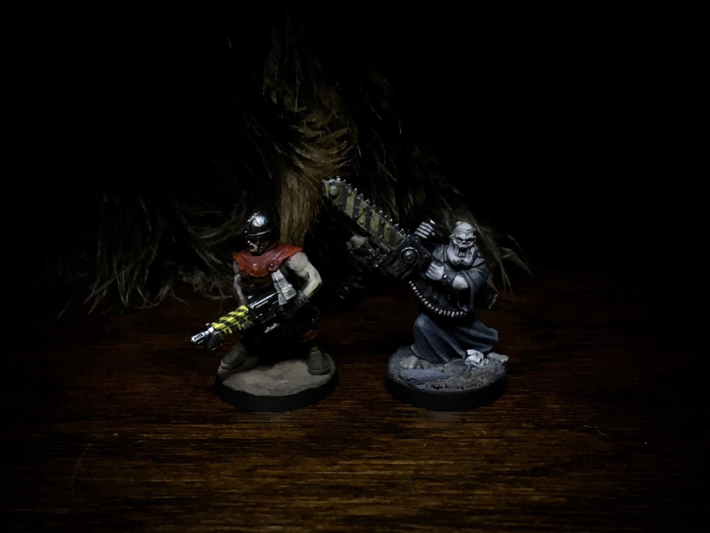
Yellow warning chevrons have become a signature piece over the years – a popular 40k symbol that I have tried to perfect into a neat combination of spark and weather. It is also just about the opposite to how the Ghost Legion palette works. This sounded like a perfect challenge. To paint a balance of my favorite effect, but in moon light. Just as I had figured out the right what I thought was a great wait to paint it, rip it apart and do it completely differently.
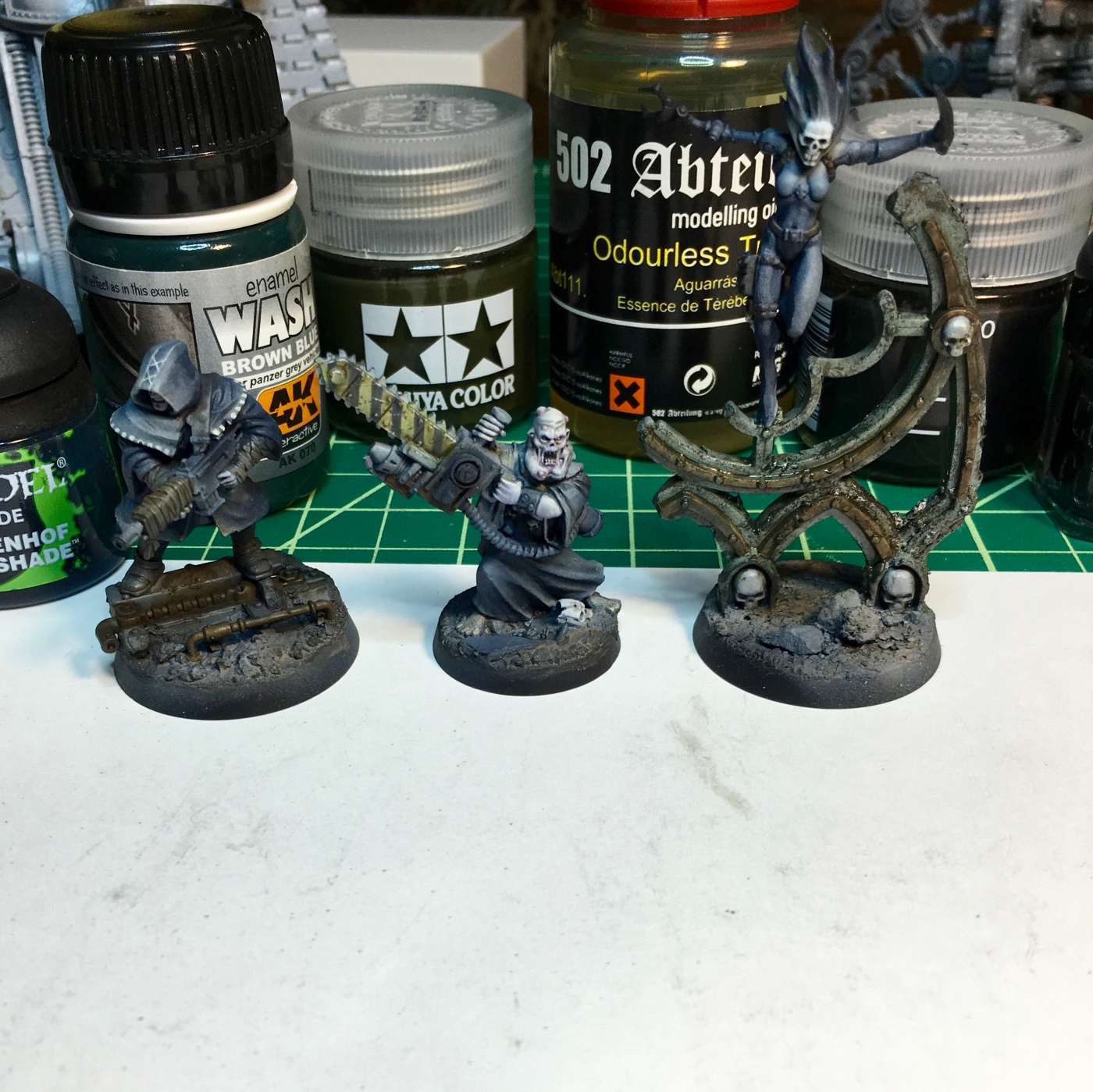
In the WIP picture you see some of the myriad of esoteric modeling liquids I use to experiment with different effects. The joy of painting I’ve got from letting the airbrush do the basic colors and apply direction of light and shadow has been fundamental. What is then left is to just apply “weather” on the models and finally do the uber contrast metallics. I’ve gone from hating the first 60-80% of painting to loving the entire journey. I’m also using the different bases as practice ground for different effects I will use for the terrain. I’ve also included a comparison picture between the church yellow chevrons and the ghost legion variety. Two tasteful but very different ways to paint my favorite 40k “symbol”.

The shading, the highlights, the depth of shadow and lighting, all of it dripping with atmosphere…you get the feeling like that’s a real feather duster in the background…oh, and the figures are great too.
I kid – these are great. The Twist is fantastic.
LikeLiked by 2 people
Indeed it is. Even dust is fought with utmost care and style on my desk 😉
LikeLike
Everything that is birthed on Iron Sleet is inspirational to me and many, many others. Love it all.
LikeLiked by 1 person
mmmm. Sooo TASTY!
LikeLiked by 1 person
I felt you where quite productive with the Vlka project but that’s nothing compared to now. You’re obviously in a place where you’re both very productive but also more expressive than ever. The twitch is a great example of that and he’s also along with the female making the group as a whole even more interesting. Question. Is the hoods a more more mortal approach to the many heads of the hydra?
LikeLiked by 1 person
Thanks. The hoods are definitely a statement. Shrouded Ghosts. More explicit Hydra references are in the thinking too.
LikeLiked by 1 person
a lovely style has developed with the airbrush introduction – so subtle so smooth and very unique ….
LikeLiked by 1 person
Thanks 🙂 looking forward to showing these in person.
LikeLike
Indeed, it has been interesting to follow your airbrush style develop from the first times you used it to this date. The palette you’ve moved towards is much more restricted nowadays and in a way “realistically dull”, which gives the figures themselves and their lines more attention. And I’ve always loved the way you’ve been able to do your magic with the random bits and put together these masterfully kit-bashed creations!
LikeLike
Thanks. I think what disappear in the images, is how much contrast there is actually. Partly due to the restricted palette, partly due to the smoothness and realism of the “zenith” highlight approach. I’ve sometimes called this style uber contrast – just not with color, more with light and dark and matte and metallic.
LikeLike
Beautiful? (check), inspirational? (check), unique? (check)… A modern master at work 🙂
LikeLiked by 1 person
Thanks Alex 🙂
LikeLiked by 1 person
Wonderful! The soft hues really work well together and they create such a great atmosphere. They glow with character. Bravo!!
LikeLiked by 1 person
Suberb stuff again Migs. Exploration of new paths is inspiring. Some of the textures you have created in this XX and in Vlka are completely new for me (for others too I’d say). As a not big fan of airbrushing in general, I have to say your way of using airbrush is great. The results look like really smooth and fine traditional painting, and combined with all those exotic liquids and powders it’s something really realistic and aesthetic.
LikeLiked by 1 person
Thanks SLMNN, I’ve always really disliked any effect that instantly spells our the tool that was used. I try really hard for none of this to look airbrushed, but at the same time get the benefits of very realistic light and shadow, super fast and smooth color. Using oil paints for the weather layers is really critical too. The Vlka were definitely a great testing ground for all of these effects and in some way it’s funny to think of this palette as the restricted one as the Vlka had less colors, and less saturation and some how the few sparks of bright red have massed that 🙂
LikeLiked by 1 person
” I’ve gone from hating the first 60-80% of painting to loving the entire journey. ”
The airbrush did this to me too. Strongly chiming in with the sentiment.
The results show.
There’s a strong theme of digesting past experiences in the post.
I’m thrilled to think we’re also unconsciously laying bricks for the next big thing. But maybe it’s better to keep that unconscious for a few months still, and give this epoch the ending it deserves. The organic nature of the project is an interesting beast!
LikeLiked by 1 person
Would love to see a list of paints used and a tutorial on the black/grey effect or an approximation of how you did it as it is stunning.
LikeLike