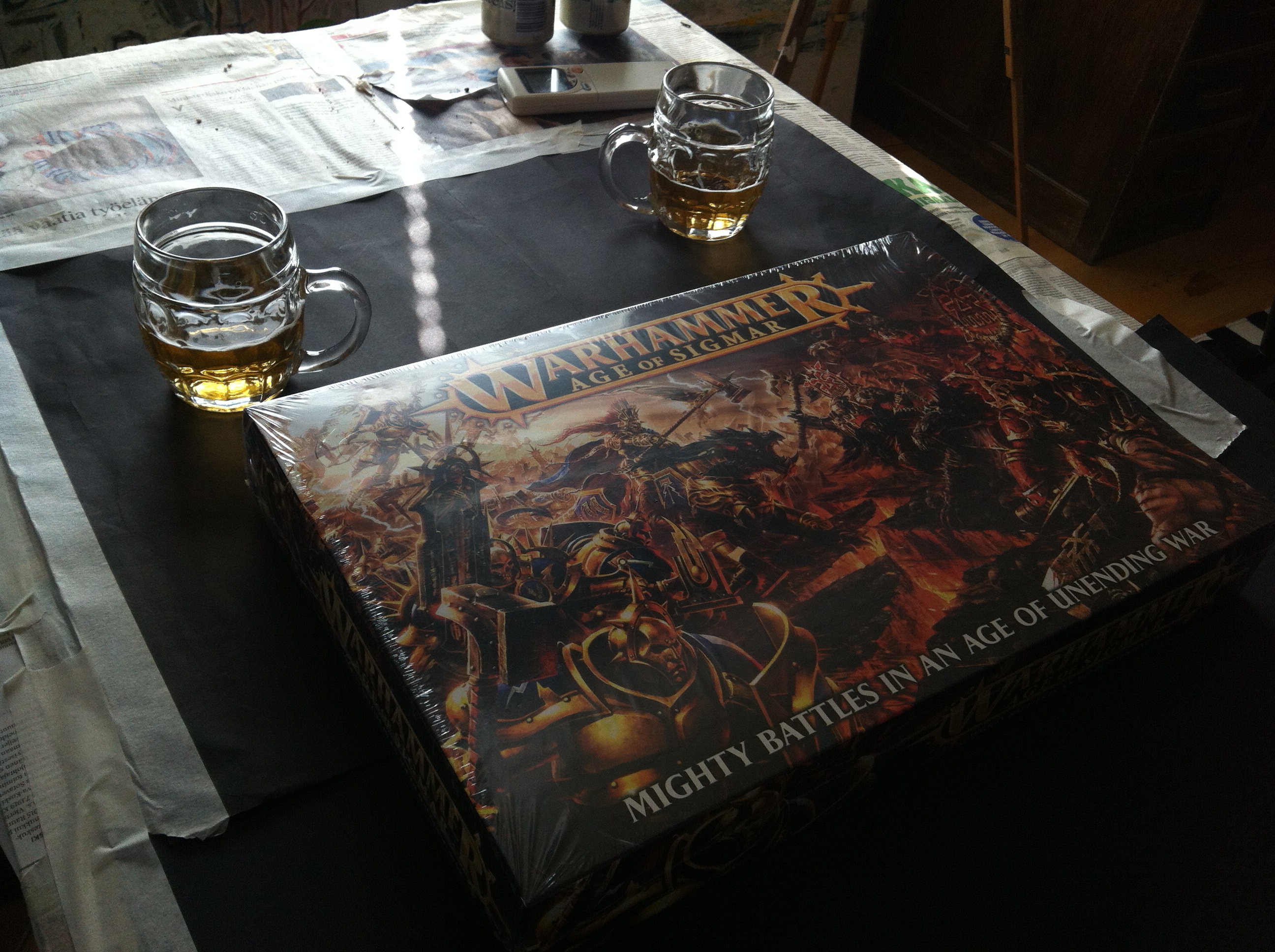
M: “OK here it is, The Age of Sigmar box!”
K: “Cool”, “and oh’ please have a beer Mikko”
M:”Thanks”
M: “Okaye, lets crack this box open then!”
K: “Wow these sprues look so promising!”
M: “All I see (when looking at the Stormcast sprues) is Thunder Warriors! So many details that fit right in without any modification!” “In fact, I must be very careful not just assemble these and replace the hammers and shields with bolt pistols (and end up doing the same thing everybody else is doing);)” “It is almost too easy now;)”
K: “These Khornate sprues are just loaded with so many cool parts, perfect for my Red Corsairs project! I think I can already see some of these turning into Chaos Space Marine Scouts!
M: “think about this – finally you can use FB models in your 40k projects and use the original bases”
K: “Totally, but hey! you seem to get all of those 40mm’s!!!!!!!
M: “Buahahahahahahahha!!!”
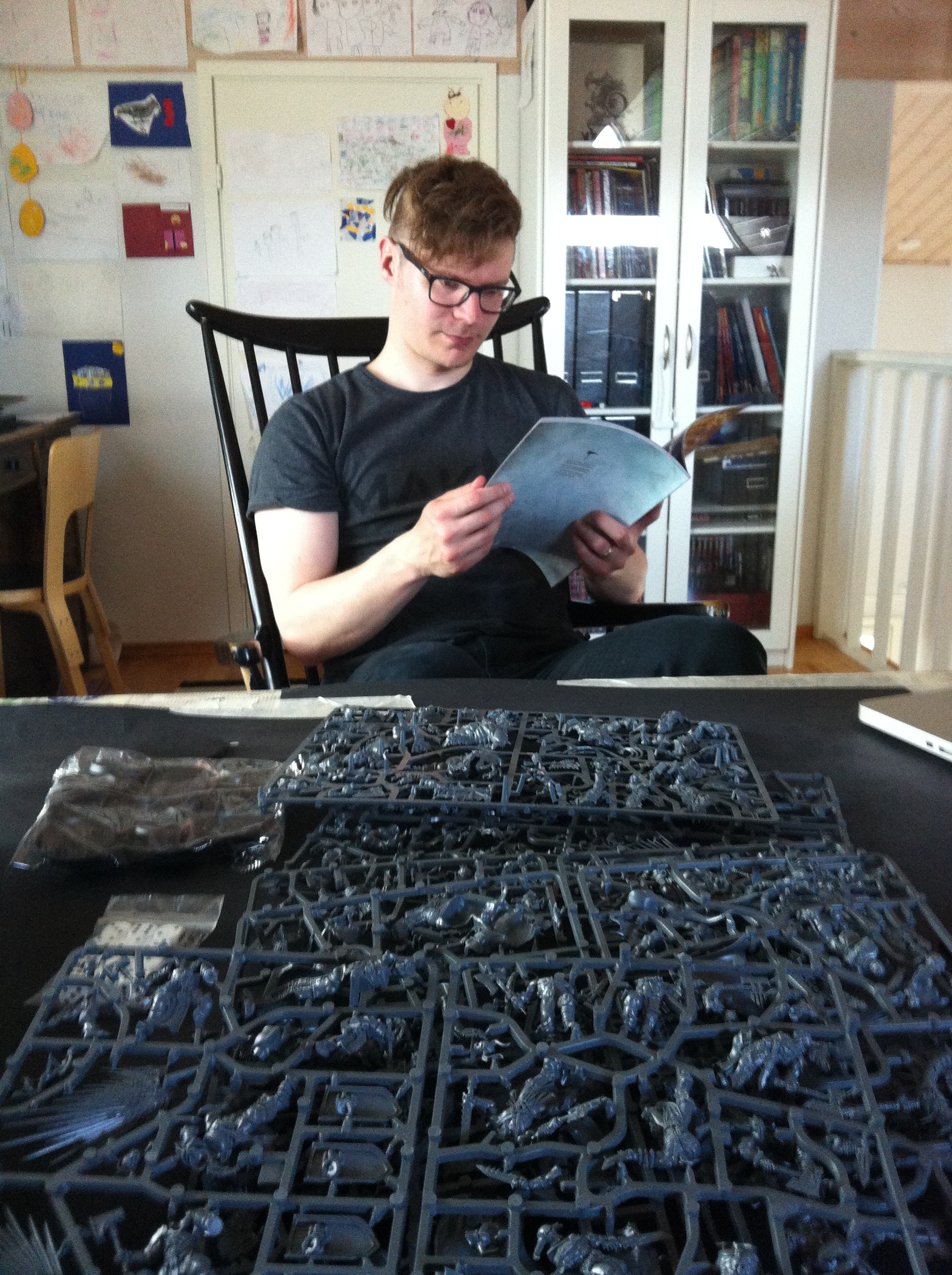
M: “Check out the rule eh,,,, book! “Does it include any cool artwork?” “Maybe there’s something from John, there always is=)”
K: “Nope, there’s none, only hastily prepared digital ones” and oh, look at that photo!!! there’s even a cut ‘n paste error in one of those Sigmarite archers! that guy is missing half of his bow”
M: “Sad” The level of the artwork in this book makes me really sad….
M: “But the miniatures that come with the box are ABSOLUTELY GOLD!!!!!!
K: “Aye, some of the best ones GW has made so far”

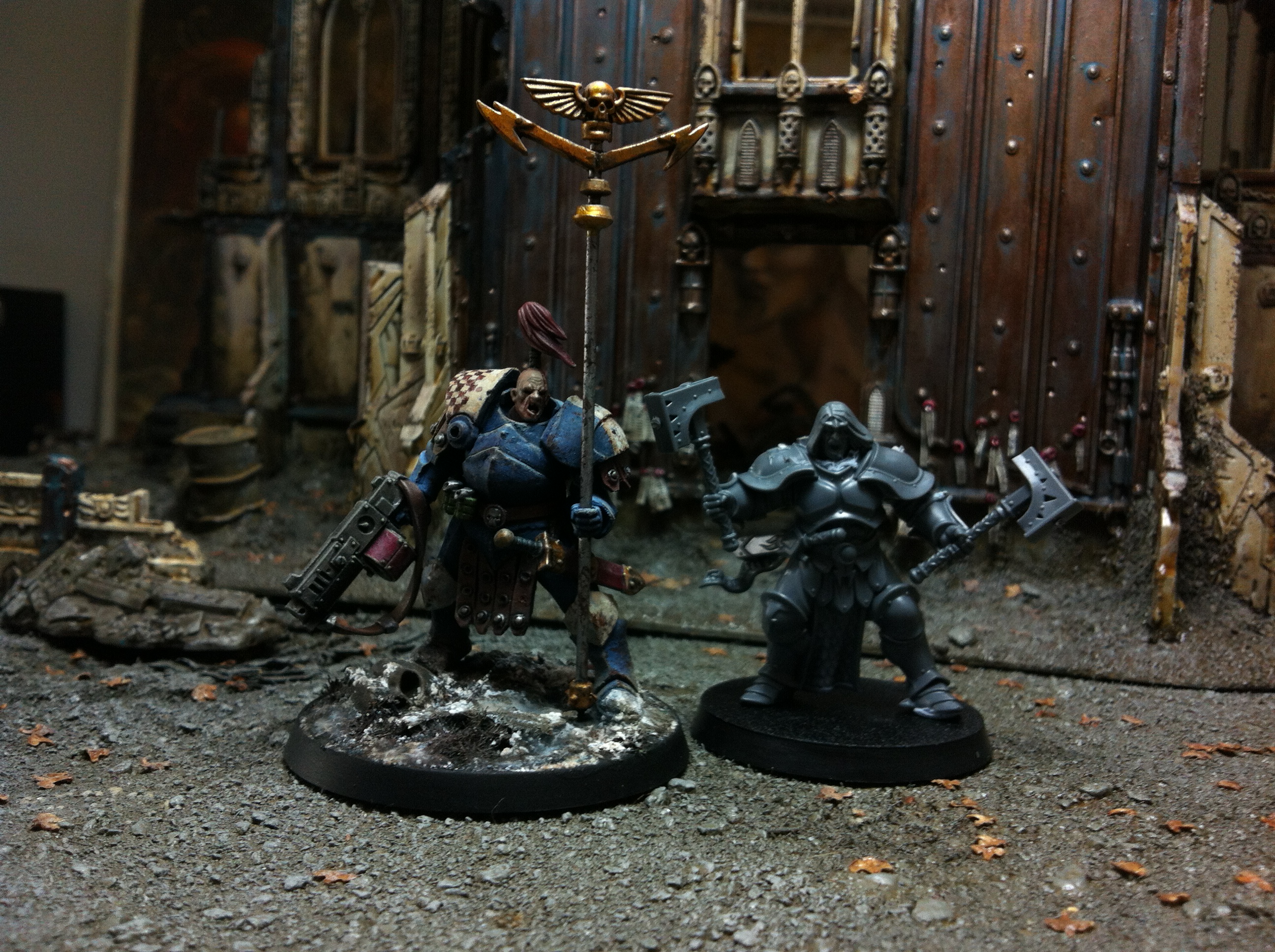
28mm of the 80’s compared to the 28mm of the 2015!!!!

Yay! There is no excuse for you guys now…I look forward to see a sh*tload of Thunder Warriors and Red Corsairs from you guys in 2015 😉
LikeLiked by 1 person
Same here gents!! GAME ON 🙂
LikeLiked by 1 person
Oh yeah… you are committed now guys – can’t wait to see what you do with this set!
LikeLiked by 1 person
I don’t think it’s fair to shoot down the art in that little book. Most of it is amazing and certainly wouldn’t be considered “hastily prepared digital ones”. Remember that Blanche is the Art Director for GW so he has a hand in everything, even if he hasn’t contributed himself.
LikeLike
I would tend to agree with JL, the art in the Age of Sigmar background book is pretty good, more akin to what we had been used to. I was really pleased to see the dramatic improvement in artwork in the book, compared to the recent 40k codex books. The 40k books have really taken a major hit in quality lately, possibly due to the rapid release rate. The Dark Angels book is particularly bad; I did a post looking at the art and comparing it to previous DA books, the contrast is striking:
http://betweenthebolterandme.blogspot.com/2015/06/codex-dark-angels-look-at-artwork.html
As for the new models, I think they are quite good, and prefect for all manner of conversions. I cannot wait to see some new Thunder Warriors. And Corsair scouts sounds very promising too!
LikeLiked by 1 person
Whoa! Never realized things were that bad, even with Space Marines 😦
LikeLike
I’m going to return my new DA book. I cannot get my head around how this happened. Some folks within GW must be ballistic with rage that this is the quality of their imagery today. 😦
LikeLike
Uh-oh, that DA book really looks weak… Karl Kopinski sure brought good fuel to the 40k universe.
About my critique regarding the art in the AOS rulebook. The overall quality of the art is very good – maybe a bit repetitive for time to time IMO – and you can tell that the artists are very talented in their field of expertise. But the thing is, I have been staring the video game concept art the best part of my life, and feel that the art in the AOS is very similar to that genre; it’s very generic and mainstream, something that will no doubt hit in the most hobbyists. It’s like the art of AOS doesn’t even want to take any risks at failing.
But me, it makes a bit sad.
It’s not the aesthetics of the characters (the design of them stands out pretty well and is unique in many ways), but I like spotting details from the background of the images, and some of the pieces in AOS just lack that part. Might have been the extreme deadlines pushing the artists to their limits and finding shotcuts though… And I’m not that much of a fan when it comes to things painted with digital platform either.
But that’s just me, and might be alone with my thoughts too…
LikeLike
I see what you mean Kari. I think one aspect that really hurts the art, even some of this better executed stuff, is that it is all just depicting the models that come in the box. The old Kopinski stuff was so great because each was brimming with the artists own imaginative creations, foreground and background. Ultimately, I am just happy that at least the art in this AOS book is at least well done, because some of the other 40k books just aren’t anymore.
LikeLike
I think there are a couple of things that have changed in GWs art production in recent years that we could all keep in mind…
First, the visual consistency of the illustrations in relation to the models. Over the last few years we have seen this taken to a greater degree than previously, to the point where most things present in an illustration are available as a models. And while this has always been the case more-or-less, I think the main thrust behind it is to keep an already bursting potentially-uncontrollable IP controlled, and growing where it needs to. Without that control, too many illustrators would slip in too many idiosyncrasies, diluting the IP.
Second, the increased share of duties to freelance illustrators. GW obviously still has an in-house art department, but in recent years they have opened up opportunities to freelancers. The trouble in that is that many freelancers don’t fully understand the IP, and some of the ones that get jobs haven’t had a lot of time to develop a sensitivity to the IP in order to render it with confidence and panache. It’s perfectly reasonable to uphold the work of Kopinski and Dainton as the epitome of fully-realised grimdark (and I am a die-hard Dainton fan), but keep in mind that these guys sport incredible draughtsmanship that is only attained from years of experience working from an academic art standpoint.
As an aside, check out this Citadel Journal cover from 1999, by Dainton >> http://www.scribd.com/doc/223219744/Citadel-Journal-38#scribd Today, Dainton is some kind of art god(!), but sixteen years ago, simply the seed of his future virtuosity. We all start somewhere 🙂 Sixteen years, chaps…
“Does it include any cool artwork? … Nope, there’s none, only hastily prepared digital ones.” I think that one gave me a nose bleed…
LikeLike
Phiq, “Nope, there’s none, only hastily prepared digital ones.” – That might have been a bit over dramatic depiction of the thoughts that the art in the rulebook arouse in me while I was browsing it. Often I’m not very good at putting my thoughts in to words, and clearly this wasn’t one of those moments either.
My intention was to say that I was disappointed to see so many picture perfect poster images of the new era that somehow lacked the momentum and roughness, the kind the old narrative imaginary of artists such as Kopinski/Dainton were able to pull out of the GW IP. Yes, the new game is just planting its fresh roots on the hobby ground, so there may not yet be that much to show off at the moment. And yes, I haven’t been a keen fan of the current art style of the GW for a long time. I have my own reasons and don’t expect others to fully understand them. You could describe it as a rebellious act against public conception of what is “perfect” and what is not, or what ever. Its a long story, which I may share at some point in this blog.
Never the less, your point was well argued and very illustrative. Didn’t mean to insult any of the fantastic artists both at the GW and freelancing for them with my comments. My intention was just to give my interpretation of the art that I felt in that very moment I browsed the book.
LikeLike
Hey Kari, thanks for your reply. All good, all understood 🙂 Ultimately, I’d say I agree with you on the art issue. Though personally, I can deal with a dialing-back of the grimdark, so long as the design sense is still strong. Thankfully GW are still very sharp in that regard.
LikeLike
I’ve bought a box too, but I’m finding it really hard to decide what to do with it. Part of me it very tempted to just built them straight out of the box as intended because they are gorgeous minis in their own right. On the other hand the Sigmarites are crying out to be converted into marines of some kind. I think I may end up building the boxed set straight but buying more to convert.
I keep looking at them and seeing the potential for either Emperor’s Children or Alpha Legion.
LikeLike
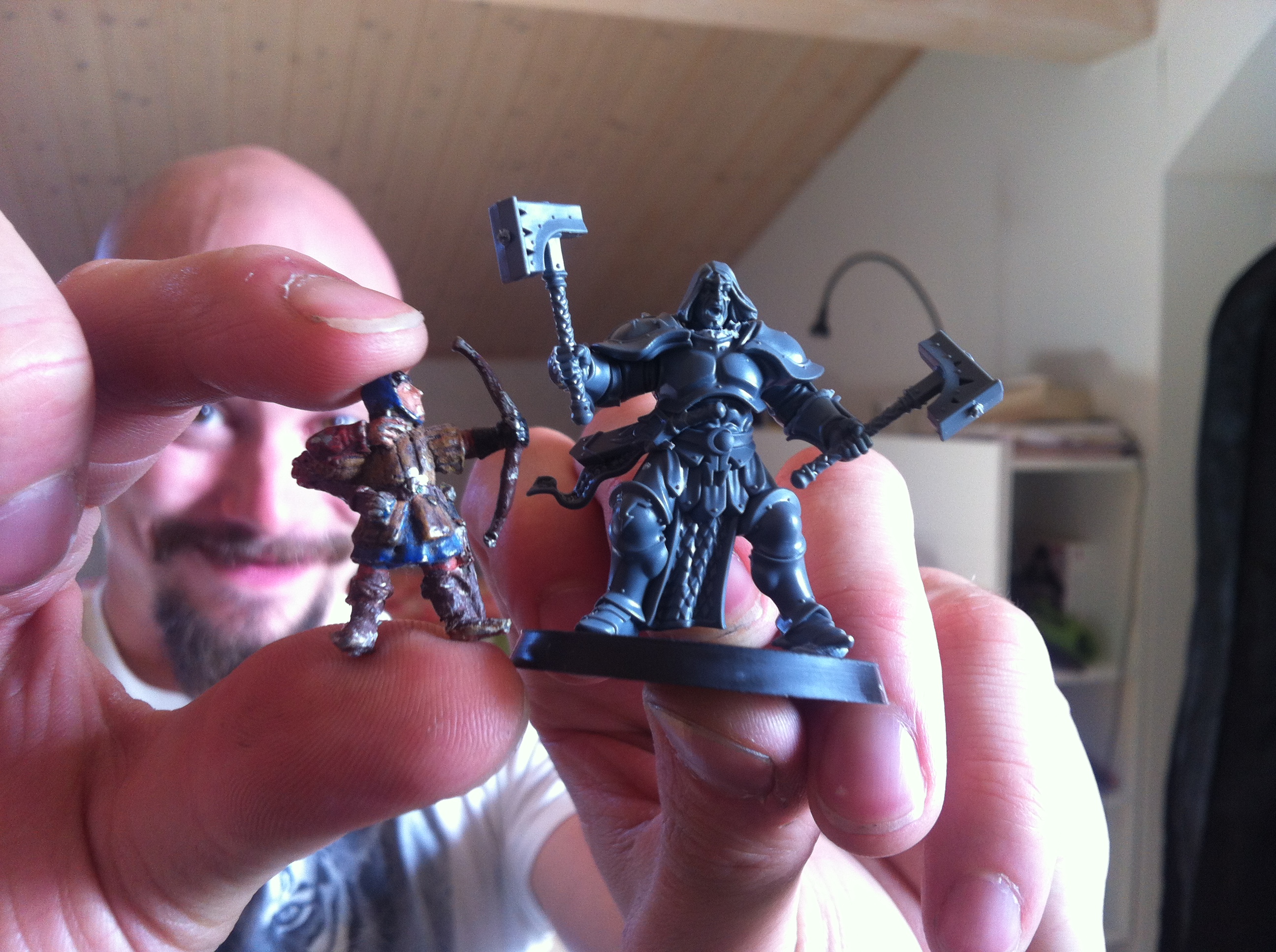
If you turn those Sigmarites into Thunder Warriors, they have the be art-scaled. The bar has been set so high with your previous TW, they’ll look like junior versions if they aren’t scaled up.
LikeLike
You bet Odie! They will be art-scaled alright:) but already feeling sorry for myself for that is ALOT of work!!!
LikeLike
Yep, it looks like the poses include lots of elements that make it really hard to add more height to the character, such as loincloths etc.
LikeLike
Yeah, I don’t envy that job at all.
LikeLike
Who said that it should be easy 🙂
LikeLike
Not the art art director, changed jobs – in the last couple of years of employment , 67 in three months, utilising mi tyme in embedded within the scuplting department sketching concepts …..
LikeLike
Mr Blanche, why did you let them kill Warhammer?
LikeLike