
Jaenz – Mercenary by trade, Pilgrym by chance
He had always been a soldier. Earning his coin doing the dirty work for others. He had worked for all types. On many worlds. His quick-shot reflexes and sure aim had kept him alive. A serving guardsman in the armies of the Imperium, a hired gun for an illustrious rogue trader, even a 7-months manhunt serving the Holy Ordos. Many jobs, many faces, many ”tasks”. Simple tasks involving his trusty rifle.
And now he was on the Pilgrym road. On Terra. The birth of Mankind.
He’d choose another system any day, but chance had brought him here. And there ought to be work if he found the right people. Maybe he could team up with a few of his own kind. He looked at faces, clothes and equipment. Scanning the endless crowds for those traits of character he carried himself…
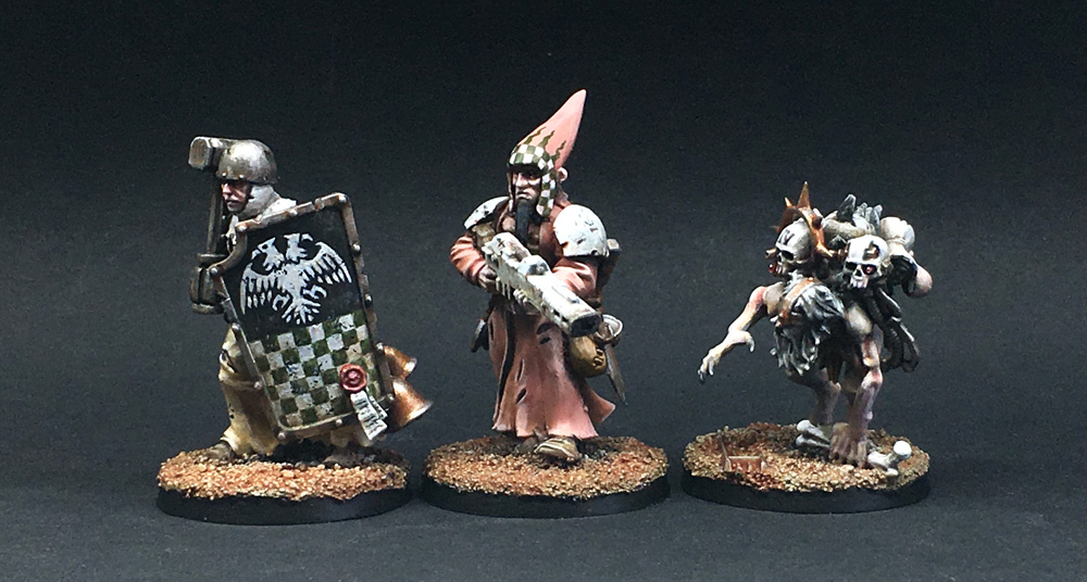
My first 3 models
I finished my 3rd Pilgrym character this weekend.
2 hired guns – mercenaries – having met on the pilgrym road. First, an anonymous religious man favouring fighting at close quarters where his resilience to pain lets him fight on and on. And Jaenz, the pragmatic gunslinger who constantly revisits his odds and options – today the pilgrym road, tomorrow coins might take him somewhere else.
And finally, the wretched rat catcher looking for soldiers to assist his master to follow his greater call.
I want to use those classic colours from Dutch 16th century painting. The faded red and yellow. Also, some strong heraldic graphic work. The photos here are top-lit, but the models themselves are actually painted with emphasis on the shading. The eyes are hidden in shadows, even in the paintjob.
My approach to the project is very much about creating, building and painting along the way, keeping options open for new techniques and ideas. So the plan also includes adjusting the models as I see it fit, when I have the whole group painted to make sure that everything works together.
JRN


Classic JRN with a twist! Brilliant stuff Jakob.
I love how you have used some of the colour schemes that has been your hallmark for more than a decade combined with excellent technique and details like the checkered pattern (the classic part) and then weathered them (as in using the shading and weathering to ground them in an actual Terran setting) to fit into the narrative of the strenous pilgrimage these guys have endured for a long time.
Great to see the backs of these too…the battered shield on Jaenz is an excellent touch.
LikeLike
Thanks mate. Did not really think of it like that… Weathered hallmark colour scheme… but I like it. And it is quite a precise description of my reasoning for choosing the colours.
LikeLike
Love the feudal vibe that’s going on here – colours are lovely – I love Flemish art …….there’s so much scandiwegian talent going on here anyway – the northern rennaissance and the gothic medievalism – huzahhhhhhh ……..
LikeLike
Thanks a lot.
LikeLike
Sharp and yet gritty!
LikeLike
Lovely. That aquila shield with the checkers is spot on.
LikeLike
I thought you would enjoy that particular detail. Thanks!
Took a little planning and a sketch on a piece of paper to decide on the right layout and the shape and style of the eagle.
Stuff like this usually rewards preparation and practice. Like most things in life.
LikeLike
Word.
LikeLike
Dang those faces are something lovely. Beautiful work on the warband.
LikeLike
Thanks. I’d like to add that these faces are so rewarding to paint. Great miniature design.
LikeLike
These are the sort of miniatures that grab my attention, simple but packed full of character.
You can see the skill without having it pushed in your face, in fact they demand you spend the time looking just incase you missed something.
LikeLiked by 1 person
Really nice – I love the de-saturated colours you use here, awesome freehand, and the faces are superb!
LikeLiked by 1 person
Cracking stuf! I just adore it when people inject a heavy dose of medievalism into their 40k and this is a prime example of why it works so well.
LikeLike
Brilliant. Love the fluff. Love the models.
LikeLike
Great stuff. That broken shield is a really inventive touch.
LikeLike
The faded red is amazing. I was wondering if it were like that in real life as well, and then I read the text. I really hope your photos do it justice. It’s a testament to your long painting career that you are able to do so much with so little. It’s all very basic, but the level on confidence in the brushwork and carrying through with the details set this whole group to be from another time. Or maybe timeless is the correct way to put it. These are characters which would look exactly as compelling ten years ago, or ten years from now. They belong on Terra.
LikeLike
That’s well put Toni. They are vintage JRN, with enough exploration to stay fresh and avoid the pitfalls of mannerism, yet so timeless.
LikeLike
Cheers Tony. That faded red is one of those tricky things to achieve.
Just working back and forth, trying different starting point. I ended up using a fleshtone (P3’s equivalent to the old Dwarf Flesh) with a touch of magenta ink mixed in.
Adding white for highlights and working in black and browns for the shading. Oh, for those cold shaded areas – underside of the hat for instance – I added P3 Greatcoat Grey, a dark bluegrey. Dulls down the warm fleshtone instantly.
LikeLike
Beautiful models JRN! Seeing the WIP pictures didn’t really inspire me much one way or the other, but painted with such clever reference, your masterful technique that isn’t suffocated under it’s need to show of, but quietly and confidently just is and is beautiful. I’m left really thirsty for more and can’t wait to see what you do with the tree!! And to see these in real life. I think they will couple particularly well as two ends of the spectrum with the XX, your muted, strong primary colors , created perhaps by natural dies worn in UV glare of the sun, vs my nightly blues and greens rendered muted by the moon.
LikeLike
Thanks Migs, for the honest words and the compliment for the paint job.
This kind of feedback can really drive progress and experimentation.
And from now, I’ll aim specifically for that particular placement in the colour spectrum!
LikeLiked by 1 person
Fantastic work! Look simple yet stunning.
You have been one of my major inspiration since i saw your Priest with an assult cannon arm! And you continue to make me aim higher!
Very, very well done!
LikeLike
Beautiful! I agree with everyone else; that faded red is perfect. I love how clearly it reads as faded red and not as a neutral pink or a neutral brown, even though that color in isolation or next to more saturated colors probably doesn’t look very red at all.
The broken shield is a nice little detail too.
LikeLike
Classic JRN with a touch of Pilgrym. Bravo!
LikeLike